
Client
Overview

Wifly Mobility
An e-bike subscription business for the carefree urban cyclist. Easy, fast, and insured.
Subscription Experience Design Project
Role
Wifly Mobility needed to enhance their subscription experience to compete with their rivals subscriber base. An easy, clear and understandable subscription flow would help visitors value the product, increasing subscription growth and retention.
Research, Information Architecture, Wire-frames, Interaction & Visual Design
Team of 4 Designers
Goal
Simplify the process to sign up for a Wifly Mobility subscription, increasing subscription growth and retention by displaying clear product information for user understanding, and having prominent Call to Actions on every page to
Problem

User feedback revealed the need for a way to effortlessly rent an e-bike because they desire an easy, fast, and convenient way to navigate their city
The current subscription process is too long and does not offer clear instructions. The current steps are confusing and pricing is not clearly indicated for the user
Discovery
We conducted a heuristic evaluation of Wify's website to identify areas requiring improvement. This process offered visibility into which areas needed adjustments, including user flows, CTA locations, field form details and user accessibility

Discovery
To begin our research, a competitive analysis of 3 competitor websites were broken down to identify strengths, weaknesses and opportunities in the subscription rental market
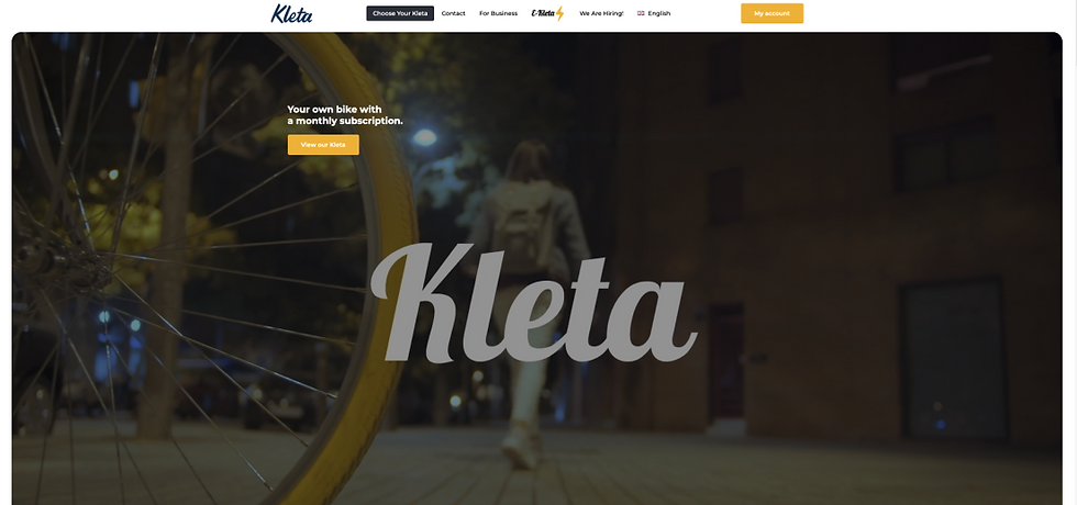
A B2B & B2C bike subscription service offering 6-speeds and e-bikes. Currently based in Barcelona, Sevilla, and Valencia

Engineered in Australia, our quality and affordable electric bikes subscriptions are trusted by 1000s of couriers, commuters and everyone in-between.

An online marketplace for bike renters that connects users who want to rent their bikes to users who want to rent (similar to airbnb)
A B2B & B2C bike subscription service offering 6-speeds and e-bikes. Currently based in Barcelona, Sevilla, and Valencia
What worked well
-
Plans were easily visible and could be understood
-
Clear CTAs. Sign Up & Login
-
Clear messaging and consistent throughout website
-
Easy & Simple sign up and login
Areas of Opportunity
-
Homepage CTAs lack a positive user flow
-
Lack of comparison ability makes it hard to chose bike
-
Product details are small and hard to read
-
Lack of CTAs after homepage
Discovery
To grasp an understanding of the importance of each page, we developed sitemaps. A current sitemap showed issues with accessing pages, maneuvering back through the site was difficult and obtaining relevant information was not an easy task to accomplish


Design
The subscription User flow was rebuilt to give users a simple, clear and concise path to signing up for Wifly Mobility

Design
The newly developed user flows and research assisted with the creation of lo fidelity wireframes. A lo fidelity prototype allowed us to pinpoint pain points and areas of opportunity for Wifly Mobility users

Validation
Usability testing gave the team insight into the usability and user experience issues we were still facing. Issues were found in the following areas: tags & filters, pricing, plans vs bikes, why ebike? and the free trial

Results
Hi-Fidelity wireframes gave us our final form of Wifly Mobility's subscription service. Through vigorous hours of research, iterating on our ideas, and testing with users, we created a simple, quick and efficient process to sign up for a Wifly Mobility e-bike subscription

